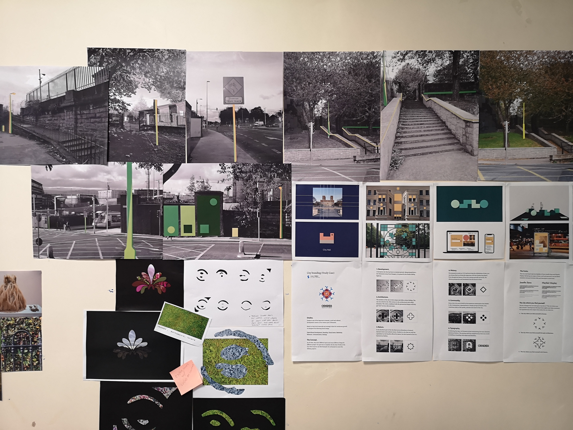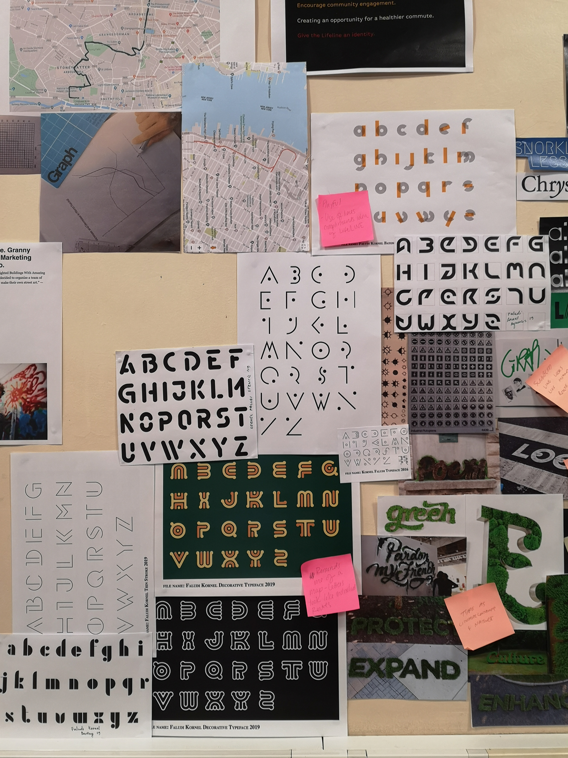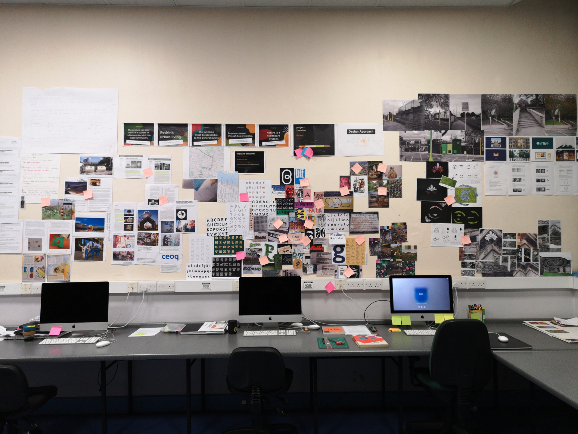
The brief for this project evolved as we learned more about Bi Urban /Desireland. Before meeting with the client, we established a rough framework of what the brief should entail and began to define the brief through our research. This gave us some direction for our preliminary study in the discovery phase.
After the first Client Meeting, we were able to define what Kaethe’s goals and objectives were. Then we boiled down to “help Desireland achieve their ten-year goal for the #Lifeline and “to create a branding outcome that achieves our five key principles” that we established once we defined our final Creative Brief.
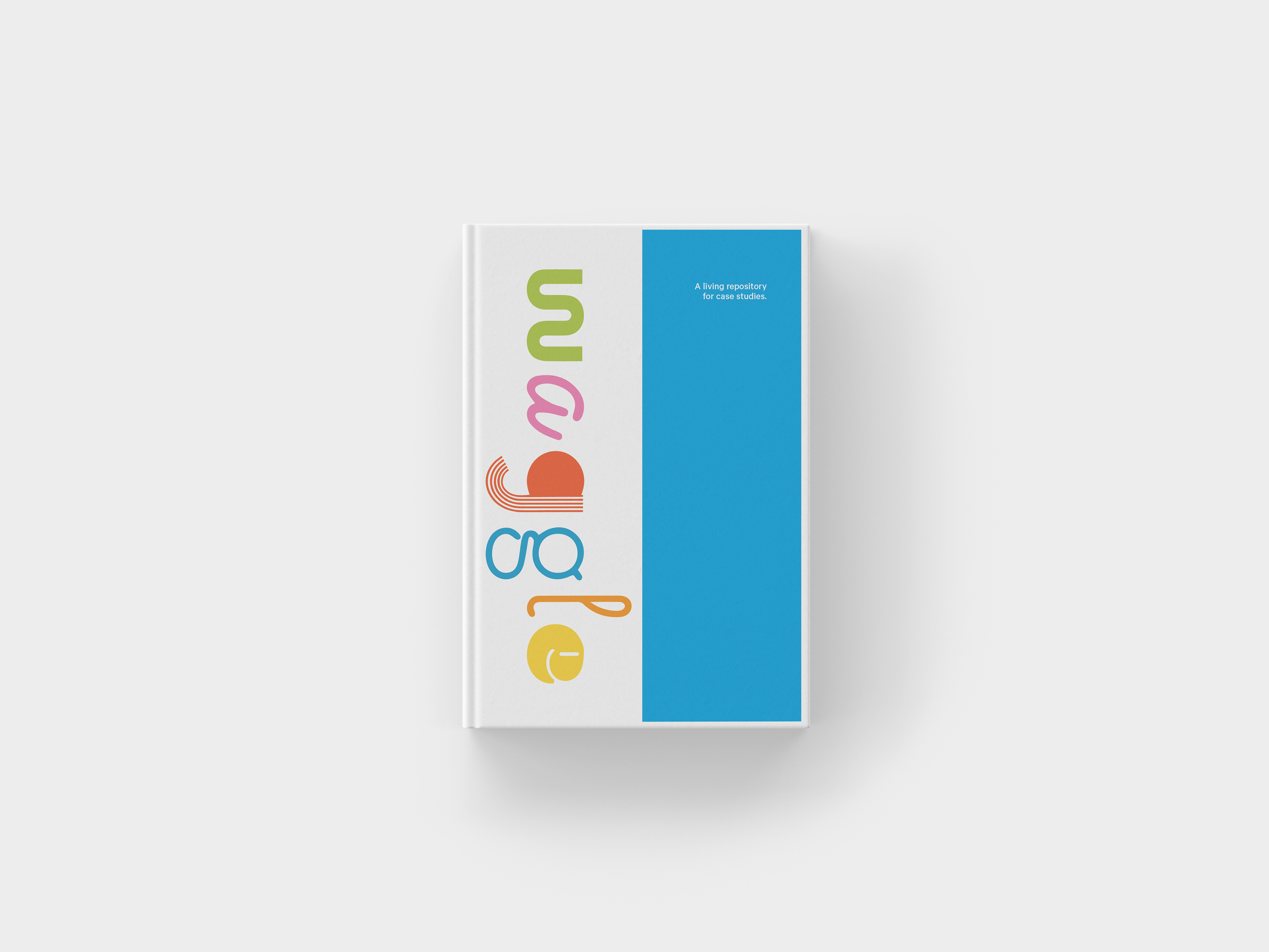
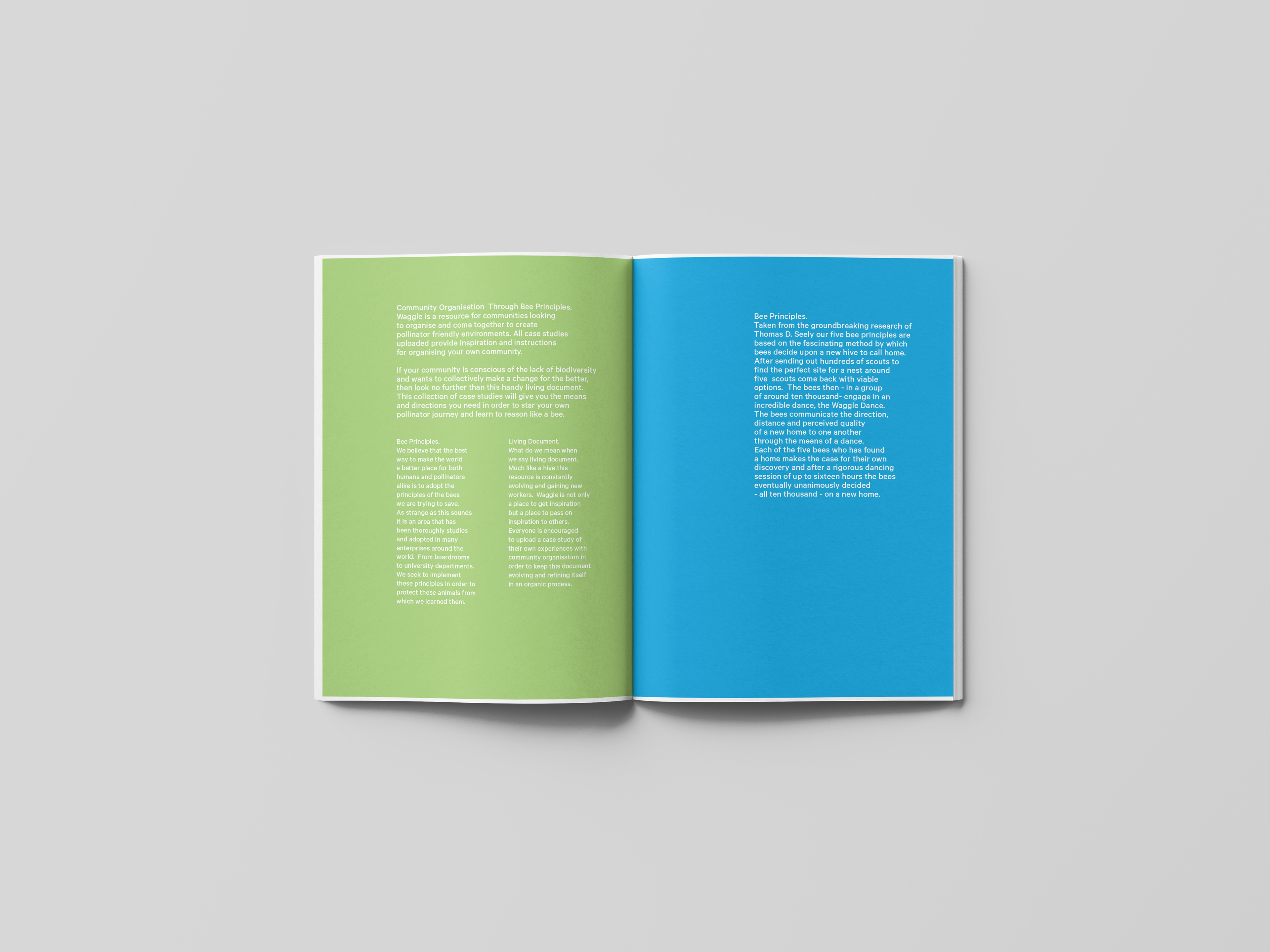
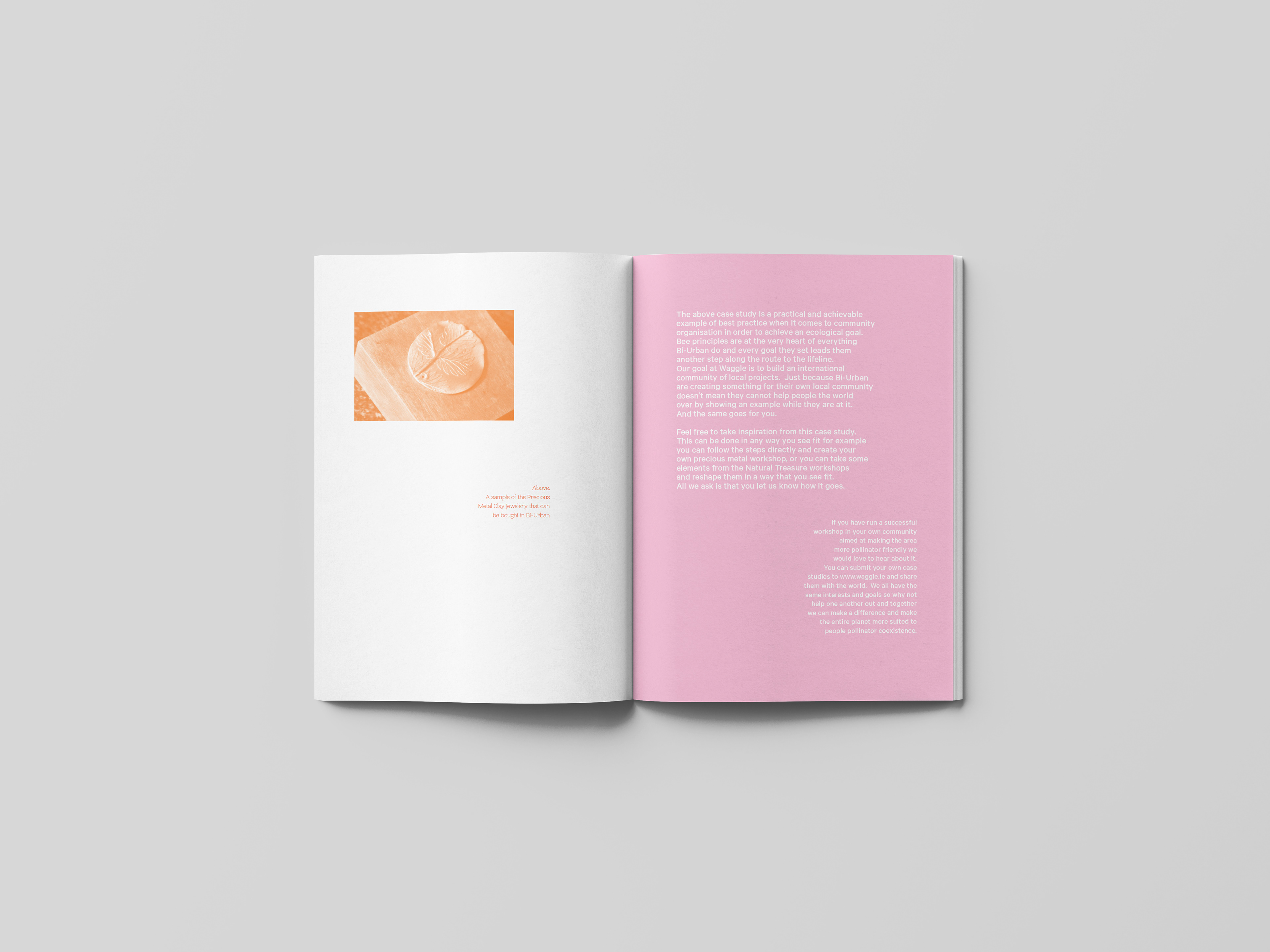
Prototype of the WAGGLE PAMPHLET in Speculative Futures Project
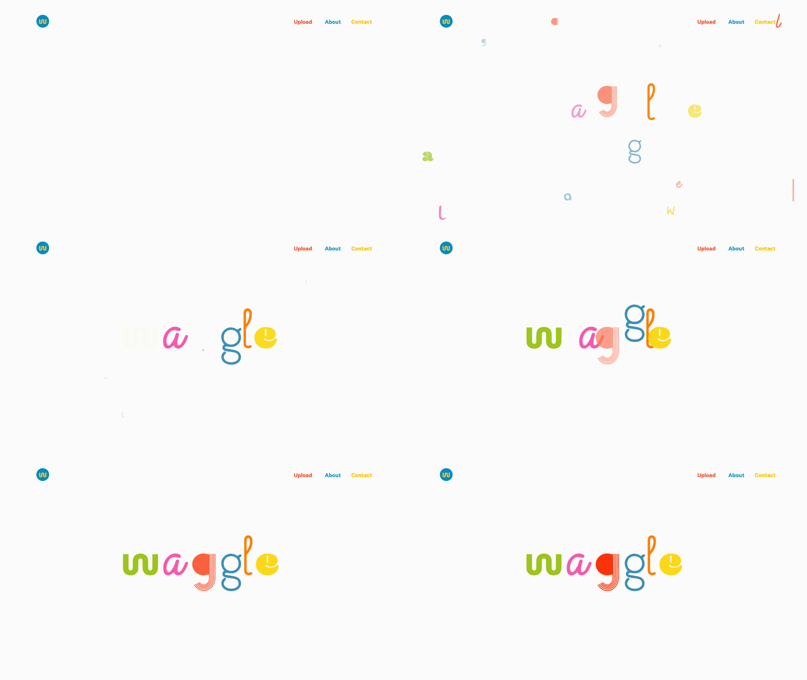
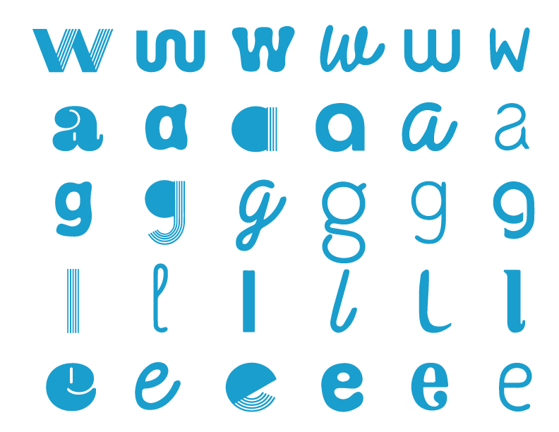
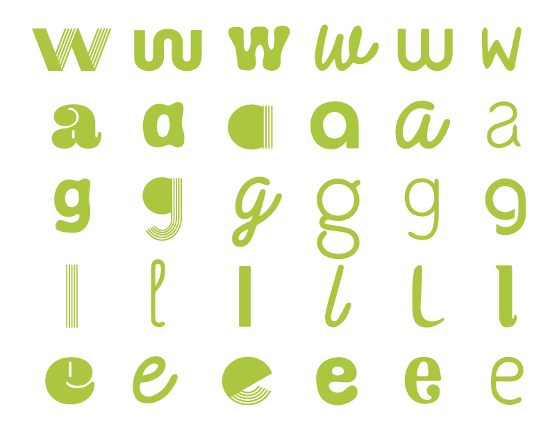
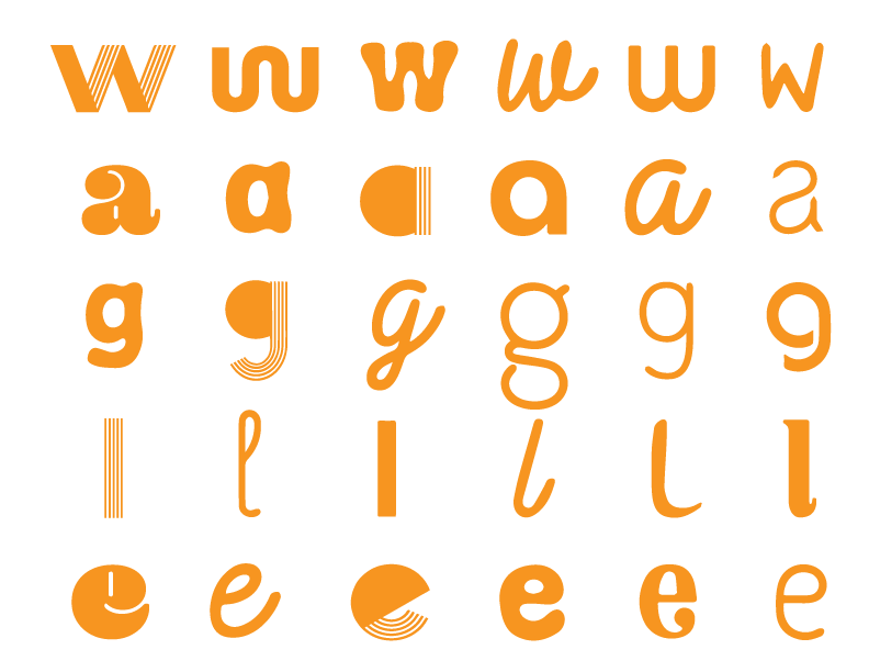
The logo is a wordmark consisting of the service's name alone. When designing the wordmark, we wanted to make it approachable and non-threatening; we also wanted to get across the concept of many different types of people and communities from all over the world coming together to achieve one goal.
With a logo designed to be modular, playful, and easy to engage with, we decided that the content of the website and pamphlet should be given a gravitas that counterbalances this, as the content is a serious matter.
With a logo designed to be modular, playful, and easy to engage with, we decided that the content of the website and pamphlet should be given a gravitas that counterbalances this, as the content is a serious matter.
This being said, after many prototypes, we decided on using Kilm Type foundry’s Calibre - Medium for the primary and secondary body text and have this contrast with Pangram Pangram’s Woodland - Ultralight for the tertiary text.
The contrast between these two typefaces, Calibre’s slick modernism and woodland’s nostalgic serif forms, would also reflect the urban and natural working harmoniously.
Throughout the pamphlet itself, we use the same colour values used in the logo to subtly break down the content into sections. Each change of colour indicates a new area. This serves to establish a rhythm through the document for the reader and to bring elements of the logo throughout the document while not necessarily bringing its playfulness into the content.
We also designed an entire family of various letter marks that can make up the word in any combination moving forward, a few examples of which can be found on the fold-out cover of the pamphlet.
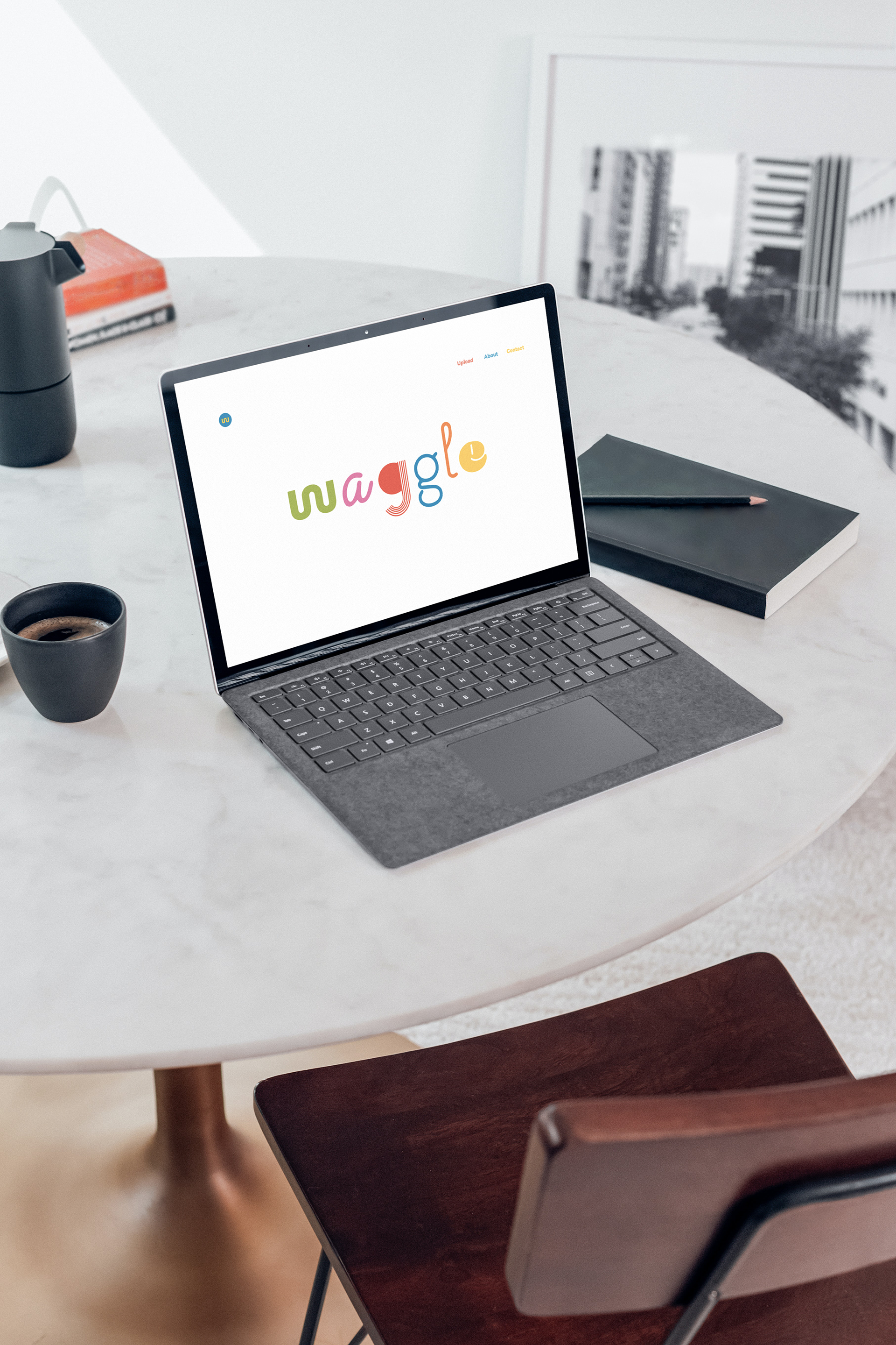
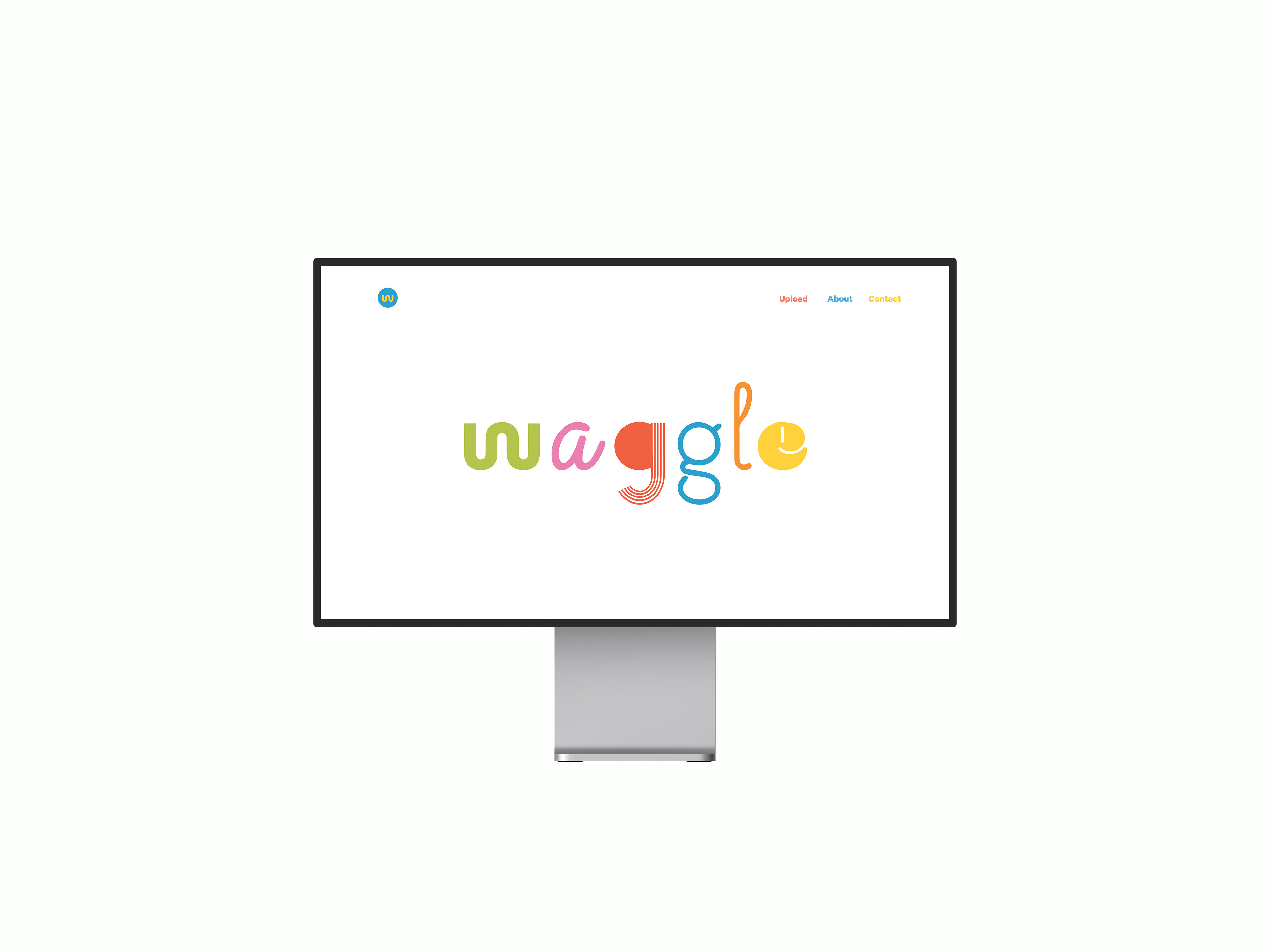
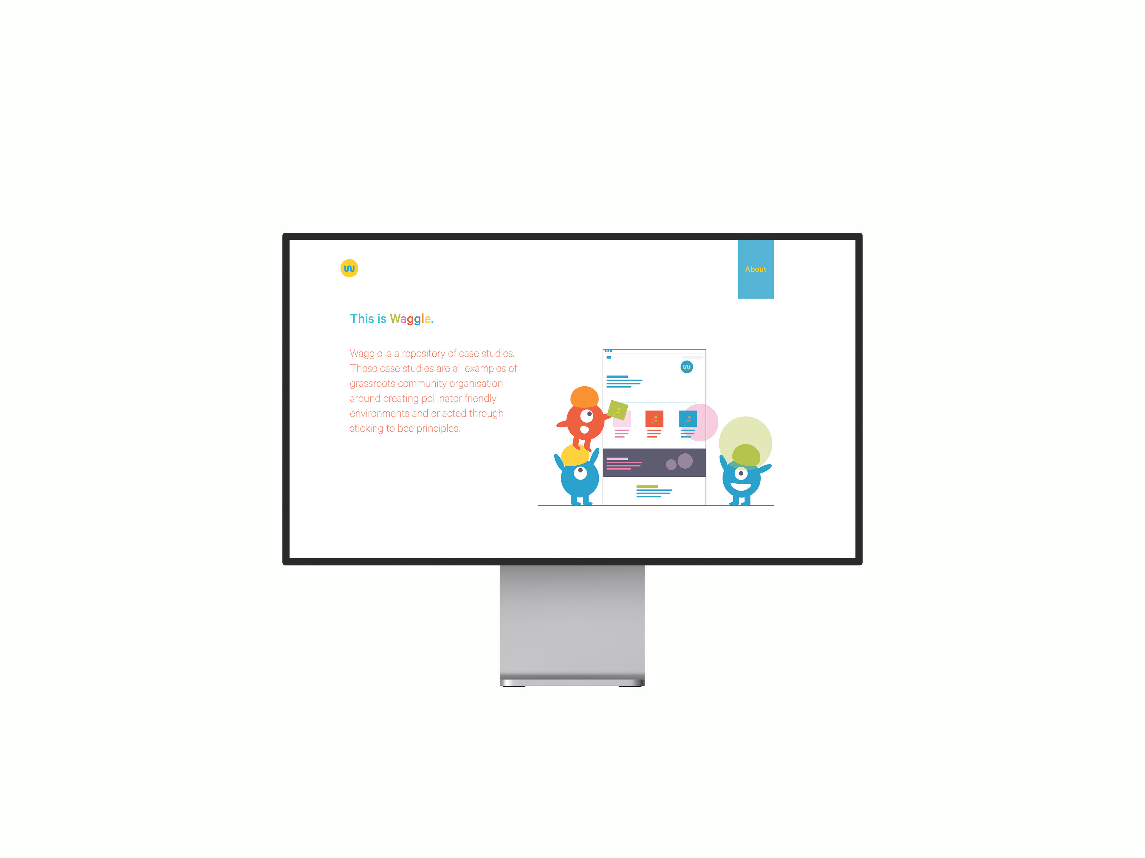
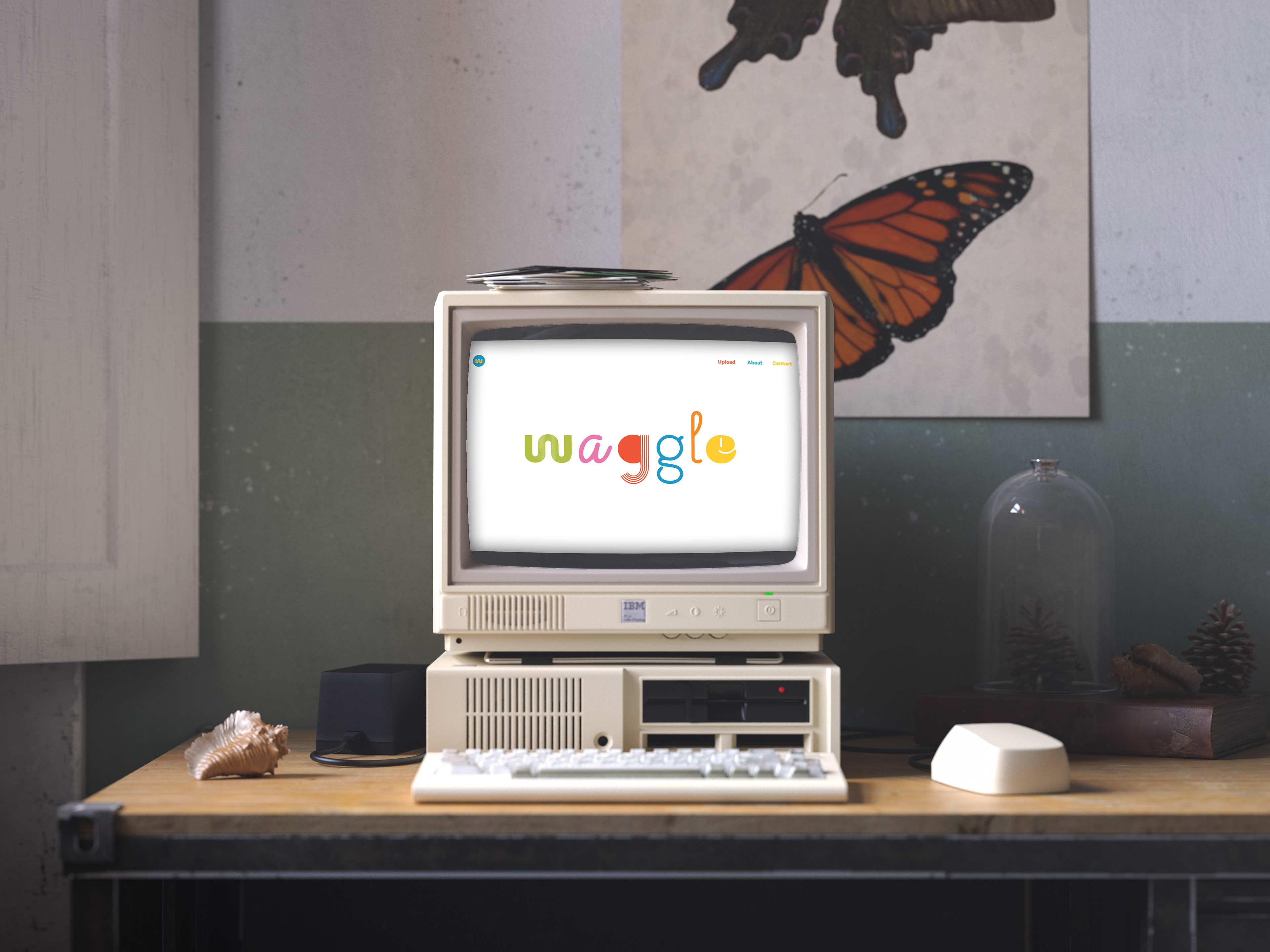
The Waggle Platform appeared as a community engager tool that will eventually feed into the pamphlet, which will be published annually with the information gathered from the website.
Our second aspect of the proposed design solution is this platform where people worldwide can get together for future workshops or share their work within the waggle community. It is a repository of case studies where community organizers can not only download previous studies but also submit their own methodologies for others to learn from. This way, Waggle becomes a group of individuals making change for the better.
The Waggle website was created as an open-source, easy to be accessed, user-friendly, and finished with a responsive design.
After receiving the original project brief, we held a team meeting to decide how to proceed. As this was the first time we met one another, we began by outlining our past experiences and perceived strengths and weaknesses so that we could best decide on team roles and how our team dynamic would work. This consisted of explaining to one another our backgrounds and levels of relevant design experience. Still, it also involved more practical discussions about how the project would work moving forward, such as where we lived, what times we worked, and how often and when we would be able to make it into the studio.
Out of this, we assigned the roles alluded to previously. We also established that since our timetables allowed, we would be able to meet up in person in the studio and work together at least twice a week moving forward. We also established digital sharing and working spaces with Facebook Messenger as a quick and easy instant communication system, Are.na as an information and image sharing platform, and a shared Google Drive folder as a place to share our files.
Out of this, we assigned the roles alluded to previously. We also established that since our timetables allowed, we would be able to meet up in person in the studio and work together at least twice a week moving forward. We also established digital sharing and working spaces with Facebook Messenger as a quick and easy instant communication system, Are.na as an information and image sharing platform, and a shared Google Drive folder as a place to share our files.
Creative Direction : Claudiu Potlog, Clara Joyce, Daire O`Shea
